Release Date: July 25, 2026
Cheers!
🎵 Fourteen arrives with owners standing in a row,
One click to PDF and your brand colors aglow,
Focus a vertical and watch the clutter go! 🎵
✨ New Features
Ownership and permissions
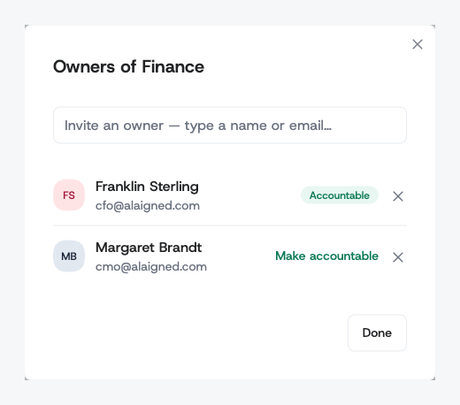
- Multiple owners per one-pager: An Owners dialog in the edit header lets you invite owners, designate the accountable one, and remove owners without leaving the page.
-
Owners can edit what they own: A one-pager's owner can now edit, approve, lock, and cascade their own subtree — AI Guide included — without organization-wide edit rights.
-
Program Manager role: A new role for people who steer delivery — approve and lock one-pagers across the organization, reachable from Admin → One-pager Approvals, without full administrator rights.
Working with a one-pager
-
One thing open at a time in edit mode: Pillars and enablers start collapsed and expand one at a time, keeping the canvas readable; deep links open straight onto the item you followed.
-
Collapsible strategy context: Purpose, Vision, Mission, and the ambitions fold into a single inline strip by default, giving pillars and initiatives the top of the screen.
-
Narratives on initiatives and enablers: An optional markdown field on every initiative and enabler, editable inline on the card and shown in the detail modal when filled.
-
Evaluation status on enablers: Enablers now carry the same status and narrative as initiatives, and feed the Strategy Evaluation Report.
-
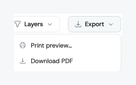
One-click PDF export: A new Export menu on the one-pager produces a server-rendered PDF that auto-fits to a single page — no browser print dialog, consistent every time.
Strategy administration
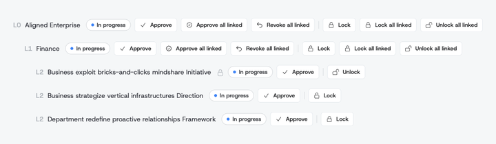
- Bulk lock and unlock from Approvals: Lock a one-pager and every linked one-pager beneath it in one action, so a finalized hierarchy stays visible but uneditable.
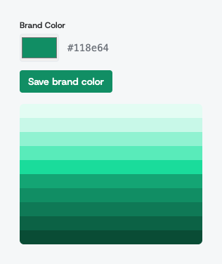
- Your brand color across the app: Administrators pick one accent color for the organization; the whole workspace repaints to match, immediately for the editor and on next load for everyone else.
Alignment and cascades
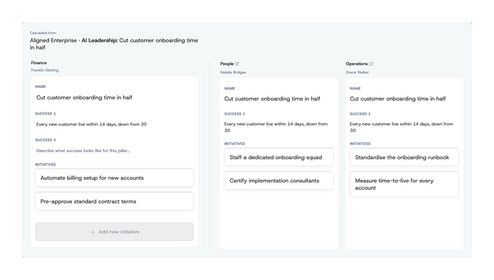
- Horizontal alignment: Every cascaded pillar in edit mode carries a peer icon that opens a side-by-side comparison — your pillar next to a read-only column for each team that received the same initiative, showing how they named it, what success means to them, and the initiatives they planned.
-
Peers are live: Peer columns update in real time as their editors type, and an avatar stack shows who is working in each one right now.
-
Borrow instead of retyping: Copy any field from a peer's column, paste it into your own pillar as markdown or plain text, or clone a whole peer initiative into your pillar as a fresh, standalone one.
-
Request an unlink from the receiving side: The one-pager receiving a cascade can now request its removal; the originator sees the request in Rejected by linked one-pagers and confirms it.
🔧 Improvements
Strategy Evaluation Report
-
Enablers included throughout: Summary cards and the sunburst now cover enablers alongside pillars, ordered pillars first, and the AI executive summary analyzes enabler-sourced cascades.
-
Initiative Details opens collapsed: Only the root one-pager is expanded on load, with Expand all / Collapse all in the section header and a tooltip explaining what each card counts.
-
Tag filters narrow instead of widen: Selecting several tags now requires a one-pager to carry all of them; ancestors remain as structural rows that no longer skew the metrics.
Propagation review
-
Attention badge on cascade cards: Changes that need your response are flagged directly on the card, so a busy Changes tab still shows what to act on first.
-
Predictable cascade cards: Change fields always list Name before Goal in every section, and cascade actions carry their own color-coded labels.
Administration and templates
-
Owned one-pagers in the users table: The organization users overview shows up to three one-pagers each person owns as pills, with a +N overflow and full titles in tooltips.
-
Editable singular item labels: The template editor exposes the singular label (Pillar, Initiative, Enabler, Value) next to the plural, so both read the way your organization speaks.
Viewing a one-pager
- Empty mandatory fields stay visible: Fields marked mandatory in the template now show in view mode even when blank, signaling what is still missing without switching to edit.
🎨 UI/UX Enhancements
-
A consistent component set across the app: Buttons, switches, menus, cards, alerts, and pills now come from one design system; cascade, tag, and filter pickers became searchable dropdowns that scrolling containers no longer clip.
-
Layers menu: Status colors, cascade indicators, and tooltips moved from three separate toggles into a single Layers dropdown that stays open while you flip switches.
-
Tree density control: A compact / standard / detailed switch in the strategy tree sets how much each card shows — compact keeps title, status, and owner in a narrower card so more of the hierarchy fits on screen; detailed adds the cascade badges in a wider one. Your choice is remembered.
-
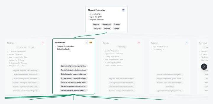
Vertical focus in the strategy tree: A zoom button on each card fades out everything outside that card's line of ancestors and descendants, then reflows the rest into the space.
-
Hierarchy hover highlight: Hovering a card in the tree dims unrelated one-pagers and highlights its full vertical, with connector lines now drawn permanently rather than on hover.
- Consistent status wording: The Layers toggle and the status modal both read Evaluation status, replacing "Status colors" and "Update status".
📱 Mobile Improvements
- Readable navigation menu: The hamburger menu now paints its own dark background, fixing white-on-white links on narrow screens.