Overview
Alaigned can wear your organization's colours. Administrators set two things — a logo and a brand colour — and the whole workspace repaints to match, including exported PDFs. It's a small change that makes the strategy feel like your company's own rather than a generic tool.
Where to find it
Top nav → Admin → Company Profile → Edit.
The Overview tab also shows a Personalize your workspace prompt with direct Upload Logo and Set Brand Color shortcuts until both are configured.
Uploading your logo
In the Edit Organization dialog, use the Organization Logo drop zone on the right:
- Click the drop zone (or drag a file onto it).
- Choose a PNG, SVG, or JPEG file, up to 5 MB.
The logo appears on your one-pagers, and in the header band of exported PDFs.
Individual one-pagers can hide the logo: the one-pager's Settings tab has a Display logo switch. That's useful when a particular one-pager is screen-shared outside the company.
Setting your brand colour
Under Brand Color, click the colour swatch to open your system colour
picker — inside the picker you can also enter an exact hex value such as
#118e64. The hex code shown next to the swatch reflects your current choice.
Then click Save brand color.
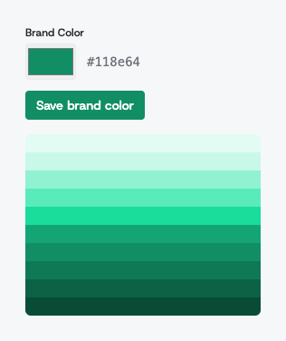
Below the control you'll see a ramp of ten shades. You only pick one colour; Alaigned derives the lighter and darker steps from it and uses them for buttons, highlights, chart segments, and the accent stripe on exported PDFs. That's why a single well-chosen colour is enough.
When the change takes effect
- For you, immediately — the workspace repaints as soon as you save.
- For everyone else, on their next page load. Nobody has to sign out and back in; colleagues with Alaigned already open will see the new colour the next time they navigate.
Choosing a colour that works
The brand colour carries meaning in Alaigned, so a little care pays off:
- Pick your primary brand colour, not an accent. It's used for the main buttons and highlights, so it should be the colour people already associate with your company.
- Avoid very light colours. White text sits on top of the darker end of the ramp; a pale colour makes buttons hard to read.
- Steer clear of red, amber, and green. Those already mean something in the strategy — they're the evaluation statuses 🔴 🟠 🟢 on initiatives and enablers. A red brand colour competes with "Critical".
If in doubt, try it: you can save a different colour as often as you like, and once a brand colour is saved a Reset to default link appears next to Save brand color to bring back the standard green.